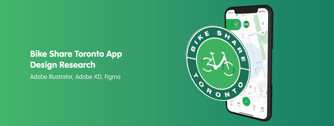
Project Overview
This project was an outcome of a 3 week research assignment in which I explored the User Experience/ User Interface elements and components of the Public Bike Share Toronto platform, the end goal of the assignment was to take a step back to when the interface was being created with the aim of understanding various elements of UX/UI such as objects, fields, collections etc. While also dissecting its design components.
This project was done with the intention of learning by RE making and RE building the platform.
Timeline: 3 weeks
Skills
User Research
Wireframe Development
Synthesis and Analysis
Tools
Adobe Illustrator
Figma
Keynote
Background
City Bike Share Toronto enables riders to plan their trip while also discover station locations, unlock bikes on the spot or even track bike inventory according to your location. As part of my research I was challenged to find the object, field and collection based on the platform.
Object : Bikes, Public Transportation, Bike Share
Field
City / Country
Profile
Info
Trip
Map
Stations
Collections
Buy a plan
Find a bike
Unlock a bike
Account
Pricing
Phase 1 : Reverse Engineer
The final aim of Reverse Engineering a platform was to analyze each and every aspect of the interaction and how the end user interacts with the created product. As well as to pay more attention to key interactive elements such as Press, Tap, Drag, Flick and Spread and what impact does it have when using the system.
- Is it an accessible and intuitive platform?
- Who is the end user and what are the intentions behind its use?
- Is it diverse for whomever is going to be making use of the application?
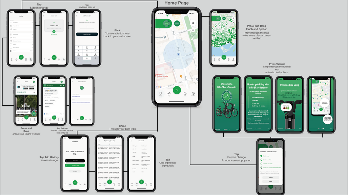

As practice I also thought it would be interesting to create wireframes to dissect the application even more. By doing this I would be able to pay a closer attention to the design components.
⚙️ Wireframe and Development

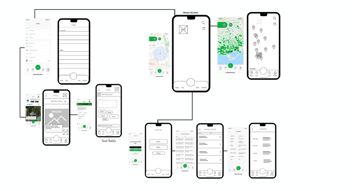
Components
I was able to unwind the design components after the creation of low fidelity wireframes.

✏️ Results
Targeted User
Based on my research and analysis the targeted user for City Bike Share Toronto is anyone living in Downtown Toronto. Mostly young adults, students and tourists who don't have any other type of transportation available other than the TTC. (Toronto Transit Commission)
Visitors and City explorers are also key to the target user as well as another factor to considers which is weather.
What aspects of your chosen application warrant improvement and how would you improve them?
Some aspects of City Bike Share Toronto that I would improve are its visual cues to ease the interactive experience the user has with the application, based on my personal experience and conversations with my peers and close friends it was a bit hard to get around the app at first, meaning the first few times we used it. I took a look at the Web based interaction design and the interactive components where much better and made me understand the way the application works better specially the process of getting a bike and returning it. The users experience would be enhanced if the application would be more personalized and diverse.
🔑 Key Takeaways
Lessons Learned
It is interesting to grasp perfectly and in a detail manner how an interface is created. It was of great satisfaction to deconstruct an interface instead of as usual just build one. I believe it gave me the right amount of insight to understand how it works and why the designers and developers decided to use the elements that are being used. Through the Reverse Engineer Process I had the chance to build wireframes for an already exiting app which was something new for me and will be used in the future as a new research methodology.